This month, I decided to spice things up a little and have some fun with this section. I have done a lot of phone reviews in the past; unfortunately, most of them had a price-tag that I wouldn’t want to go close to. If put the “smartphonephile” in me aside, I know that budget phones are always a popular expensive phones is fun, nothing is better than a budget phone that gives you the form and functionality you need, without causing a big dent in your wallet.
Design and display
Both the HTC Explorer and Galaxy Y are moderately sized mobile phones that fit well into the palm; though I must add that the HTC Explorer is slightly smaller and thicker. Weight-wise, both weigh relatively the same and are neither heavy nor clunky.
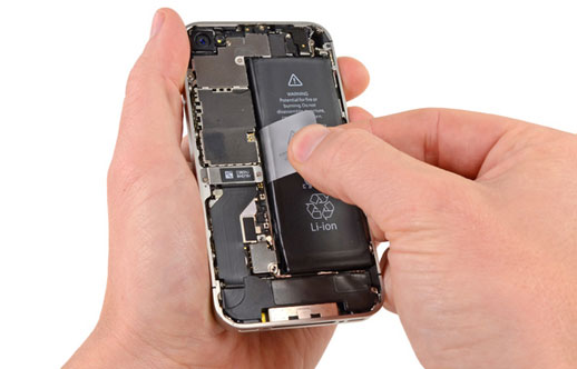
Going into the details of the HTC Explorer first; it has the quintessential HTC unibody, which I am still on the fence about. Perhaps it’s a personal peeve of mine, but there’s something about exposing the insides of the handset that doesn’t go down well with me. Also, it’s not very easy to open. For anyone who is unfamiliar with unibody, getting the back-cover to open could serve as a mini-challenge. The finish of the handset – actually of any HTC handset – is my favorite HTC design element. The slightly-rubbery plastic makes it durable, and allows for a better grip. The front is free of any hard-keys, with the only input options available being ht etouch-sensitive keys under the 3.2-inch screen – for home, Settings, Back and Search. The bottom of the handset has the microphone, while the top has the power button and 3.2mm audio port. The left side is void of any embellishments except the microUSB slot on the lower end, while the right ahs the volume rockers on the top end. The back of the handset is dedicated to the camera, which is based on a chromed panel, emblazoned with HTC logo. Buried next to the camera is the speaker grill, much like the one which is above the touch-screen in front.
Moving on to the Samsung Galaxy Y, I personally prefer its size and thickness to the Explorer’s. However, the shiny finish, along with the glossy silver panel along the sides, makes the handset appear slightly plasticky. And unlike the back panel of the HTC Explorer, the back of the Galaxy Y easily becomes greasy. If I give you a rundown on the appearance of the Galaxy Y, it is based on the formulaic design of the Galaxy series. Of course the S and S2 are high-end smart/super-phones, unlike this one, but there are streaks of similarity that binds the Galaxy series together. The front has the 3.14- inch touch-screen, below which is the hard key for Home. The top has the 3.5mm audio port, while the bottom only bears the micro-USB port.
Round 1: The HTC Explorer’s unibody is something I’m yet to fall in love with. However, my dislike for that creative decision holds little merit before the fact that the Galaxy Y is a grease and finger-magnet. I’ll give this round to HTC in a photo finish.
User experience
Both the phones are powered by Android, but have very different user interfaces. This is not surprising, considering HTC prefers to maintain Android in its default form, while Samsung likes to tailor its operating systems. Hence, the Explorer has the Sense UI, while the Galaxy Y has the TouchWiz.
Personally, I prefer the Sense UI to the TouchWiz, solely because of the fact that it feels a lot of seven screens that you can populate with different apps and widgets – typical HTC stuff. Additionally, as expected from HTC, the explorer allows you to perform limited phone functions even when the screen is locked. These functions include making phone calls, accessing the e-mail inbox, messaging and accessing the contacts.
The TouchWiz UI has always provided a rather basic user interface. The graphics feel relatively primitive and the overall user experience is akin to that on a feature phone. Also, there is absolutely no haptic feedback on the Galaxy Y, which means there is no way to confirm a command, other than to wait for a visual response. That being said, scrolling on the Galaxy Y feels a lot more fluid than it does on the Explorer. However, the Explorer has an impeccable boot-up time compared to the approximate 10 seconds on the Galaxy Y, while HTC has a 600MHz CPU, as compared to the Galaxy Y’s 832MHz.
Round 2: The HTC Explorer is a clear winner here. I’m secretly hoping the Galaxy Y takes the next one.
Call quality and connectivity
Telephony on both is the standard affair, with signal reception being significantly better on the Explorer.
The Explorer allows smart-dialing for telephony, and the tabs available (for Phone, People, Contacts and Call Log) help organize the function. However, given the size of the screen and narrowness of the soft keys, using the handset to punch in numbers makes you realize that the phone is a bit squeezed for space. The phonebook allows SNS integration (minus Twitter), so you can align your phonebook with your Facebook contacts. Call quality was crisp, with little issues on both ends. Also, the phone did not heat up when I attended calls, with Wi-Fi activated and a video streaming. Messages on the HTC Explorer are set in threaded view, and message editing is a no-frills process.
The Galaxy Y has similar tabs for telephony (Keypad, Log, Favorites and Contacts), as well as smart-dialing; contact editing is the same as in all phones in the Galaxy line-up. The Galaxy Y has retained the smart swipe-dialing/messaging option, which adds fluidity to the phone function. Unfortunately, the handset did suffer from a few issues regarding call reception, with the other party constantly complaining of volume drops and fluctuation. The message inbox is pretty basic, only slightly more colorful compared to that of the Explorer. The lack of haptic feedback was particularly frustrating when composing a message. If there is a way of activating it, Samsung really needs to tell me how – because I tried everything possible.
Connectivity options on both phones are the same, including the possibility of turning the phone into a Wi-Fi hotspot. Internet browsing, file transfer and multimedia messaging all worked seamlessly, but the experience was, on the whole, much better on the explorer. Due to the lack of haptic feedback, my sense of coordination with the Galaxy Y was really clumsy, and that pretty much marred my user experience.
Round 3: Clearly, the HTC Explorer led this one. I was totally rooting for you Galaxy Y (sighs).
Camera quality and other features
The cameras on both phones have the same MP and also share the lack of an LED flash and a dedicated camera key. The Explorer has the camera functions buried in a drag bar on screen, while the Galaxy Y splits them on both sides of the screen. Unfortunately, image quality, when enlarged on screen, is not good on either phone. The end product is noisy and clearly better on the phone’s screen alone.
For the purpose of entertainment, the Explorer has the basic music and video players. The music player on the Samsung Galaxy Y edged out on the HTC Explorer’s. The latter, unfortunately, produced a slightly noisy output, and none of the player’s sound setting could address that. Comparatively, sound output on the Galaxy Y’s music player was tame. The video players on both phones grant an adequate video-watching experience, albeit underwhelming. Since colors and sharpness on the HTC Explorer are better, it had a marginal advantage in the video player department.
Round 4: Finally, the Galaxy Y takes one.
Conclusion
If you go exclusively by the round results, it may appear as though the HTC Explorer is a clear winner. But if you pay attention to the complete review, you’d know that calling each round was not that easy. On some occasions, the Galaxy Y fell short due to some minor issues that many people often overlook, or don’t even care about. While the HTC Explorer is a winner in this phone face-off, I would make an additional not that both the phones make for good budget phones. Considering Samsung is already giving Nokia a good run for its money in this market segment, it’s good to see some healthy competition – especially if it’s from the likes of HTC!


haloo!
i’m using a HTC explorer product,
for me, the HTC product got some of their special also,
when i compare the WIFI connectivity HTC explorer with samsung product(ace,young and galaxy SIII), sometime samsung could not trace some of WIFI lines which HTC could found and connect with strongly recommended.
so i personally impress with HTC wich i ever compare the speedy and strongly WIFI to samsung product.
however samsung also still have their own proud like comparing HTC internal memory which have small internal that make me could not download and install more fun in market. My suggestion is if HTC is going to fighting demanding in market, HTC could make some innovative to leading in market. so good luck
i have htc explorer, i used to have galaxy y… Galaxy y has a 2 mp camera not 3.15 mp as on the explorer.. and galaxy y shoots a 240p video at 15 fps while explorer shoots 480p at 23 fps.. not to mension that explorer’s screen resolution is twice better than Galaxy y….. Galaxy y has a 3 inch screen not 3.14 …. you made many mistakes.. Explorer’s camera is wayyy better than Galaxy y…
Hey friends …I’m using HTC Explorer for the past 8 months…in case of music, if u connect a ear phone…then HTC is far better than Samsung with heavy bass …even if Samsung ear phones are better in HTC than Samsung…..so u choose which one is good